Handpicked favorites: A collection of our team's favorite infographics
Celebrating 4 years of Editage Insights
We celebrated our four-year anniversary all through November 2017! To commemorate this milestone of Editage Insights, we looked back at our journey, reflecting on the content we’ve published and how we have grown as a community. Our team members took a step back from their roles and picked their favorite content published on Editage Insights in various formats. The posts in this series will take you through each team member's favorite infographic, video, Q&A, and much more! You will also get a glimpse of what the Editage Insights community feels about us and get a chance to meet our most engaged members.

This is an exciting month for Editage Insights because we are celebrating our 4th anniversary in November. The last 4 years have been a rewarding experience for each member of our team, and as the Editage Insights community has grown, so has our team.
We’ve had a great time creating content to help you inch your way towards your publishing goals and stay on top of what’s happening within the industry. Each article that you read on Editage Insights is the product of fiery discussion sessions in which our team carefully picks topics that would be both educative and resonate with the current trends in the industry. And it doesn’t stop there! We also debate which content type would be best suited to effectively convey a topic – whether infographic or tutorial, article or video.
We’ve covered multiple aspects of scholarly publishing in various content formats through our 4-year journey. What better way to celebrate our anniversary than by looking back at some of our favorite content! So throughout our anniversary month, we’re going to handpick the posts that especially stood out for each one of us for different reasons.
To kick off this series, we decided that our vibrant and colorful infographics would be a great place to start. This article will individually take you through our team’s favorite infographics. Picking favorites wasn’t easy since each infographic is so multi-faceted. So our team members chose the ones that struck a chord with them – some were moved by the emotions that the infographic evoked, while others appreciated how an infographic comprehensively summarized a topic.
Not yet familiar with all the team members? Don’t worry! I’m sure by the end of this article series, you'll know much more about us. But here's something to get you started.
Meet the team behind all of the content on Editage Insights:

Although the handpicked favorite infographics varied across the team, one particular infographic emerged as the most popular – Partners in life and science: 5 Married couples who have won the Nobel Prize. Part of our 2017 Nobel Week campaign, this infographic depicts the exclusive 5 married couples wherein both partners were awarded the Nobel Prize. In addition to mentioning the couples’ prize-winning discovery, it also features a fun fact about them.
Here's a snippet of the infographic:
Here's what the team members said about this infographic:
This is my favorite infographic because I found it very heart-warming. - Clarinda
I love this infographic because it is adorable, fun, and an inspiring read! - Sneha
I found the fun facts about the couples very interesting! I especially liked what Edvard I. Moser, who was awarded the Nobel Prize for Medicine 2014, said about his wife May-Britt Moser: We have always been aware that the sum is more than the two of us. - Aparna
Who knew one infographic could elicit such different reactions from the very team that created it!
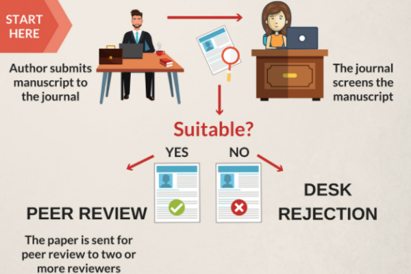
You’ll see a very different perspective after looking at Jayashree’s favorites. Since she has first-hand experience in creating infographics from scratch, her view is much more personal. It’s also probably why she couldn't select just one! Jayashree's first choice is an infographic that visually depicts the journey of a manuscript from submission to publication in the conventional journal publishing workflow – A look at the conventional publishing workflow. Here's a snippet of the infographic:
I love this infographic because creating it was a very fulfilling experience. Also, we’d been talking about having the journal publishing process visually depicted on Editage Insights for a long time; it was great to finally get an opportunity to do it. - Jayashree
Jayashree's second favorite infographic lists nine ways in which a thesis is different from a journal article – 9 Difference between a thesis and a journal article. Here's a sneak peek of the infographic:
This infographic satisfies all criteria of a great infographic – it’s visually appealing, informative, and educational. - Jayashree
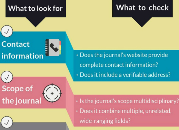
Kakoli picked the infographic that compiles some of the main criteria that researchers need to consider while selecting a journal for manuscript submission. – How to identify predatory publishers: A Checklist. Here's a snippet of it:
A useful tool that authors can print and pin to their softboards and easily refer to while checking the credibility of their target journals. - Kakoli
Sheng-Fen chose Everything you need to know about the DOI as her favorite. This infographic answers all basic questions about DOI. Haven't seen it yet? Here's a short preview:
Many Chinese researchers find DOI to be rather confusing. This simple infographic explains the concept very clearly. - Sheng-Fen
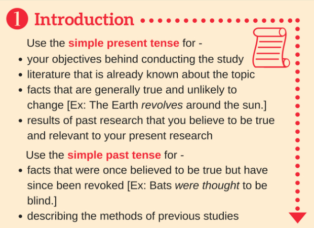
Finally, my own favorite is a grammar-related infographic – The secret to using tenses in scientific writing. This one is my personal favorite because scientific writing can be tricky at times and it always helps to have a handy guide. This infographic helps you use the correct tenses while preparing each section of your manuscript. Moreover, being considerably text-heavy, this infographic was different from anything I had ever created before. So it holds a special significance for me as I found it challenging to make this visually appealing without sacrificing any important tips. Here's a snippet of my favorite infographic:
There you have it! Our team's favorite infographics! Do you have a favorite infographic? Does it mirror any of our team favorites? Tell us in the comments section below!
Stay tuned for more handpicked favorites from our team!
Published on: Nov 14, 2017
Comments
You're looking to give wings to your academic career and publication journey. We like that!
Why don't we give you complete access! Create a free account and get unlimited access to all resources & a vibrant researcher community.
